Poster Companies – Waterloo
 Posters can come in all kinds of shapes and sizes. They can be for personal use (band posters, etc.) or for commercial or marketing purposes for events such as musical shows, campus activities, or public events. Unlike a standard one time sign, posters are great for handing out as promotional material as they're highly affordable. In this article, we will give you some tips on how to make a great poster, as well as tell you how we at Westmount can help you with that. If you're looking for the highest quality, best pricing and friendliest service for all of your sign and printing needs, contact us today!
"Westmount Signs has always stepped up to the plate to deliver all our printed needs and sign needs for more than 8 years. They help us represent our brand and have always delivered, even on short notice. They have even arranged special pick up when the store was closed and they ensure I am well pleased with the final product. They value getting it right for the client and they follow through to ensure we are well pleased! I highly recommend Westmount and am thankful they jump each time I call!"
- Brent Furguson, CMO/Managing Director, Brentwood Livery
Click here to see more testimonials about Westmount Signs and Printing
 Have a Focus
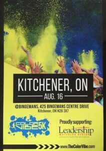
One of the most important aspects you can have on a poster is a focused and easily understandable message. For the most part, posters are usually only viewed from 3-5 seconds before a person walks past them, so having a focused direction can help get your message across quickly. The last thing you'll want to do is clutter your poster with too many images or words that can make it almost impossible to interpret in a quick passing.
Use Contrasting Colours
This is a classic move for any design process in marketing. Using contrasting colours (particularly between the background and text) makes your message pop out to the viewer, and makes it easier to read from a distance. Not only that but it naturally draws our attention, especially if you're using bold colours such as vibrant blues, reds, or greens.
Use the Space Wisely
While you don't want to make your poster so cluttered that some of the focus is removed, you will want to use as much space on the poster as possible to give detailing. This doesn't mean add as much to the poster as possible, but rather use the space to make the poster more visually appealing, such as creating more space between individual letters to make it easier to read or double spacing the lines of text. These small details can make a poster much more attractive. We have experienced professionals at Westmount that can help come up with some great designs for you. Click here to learn about what makes us different.


