5 File Preparing Tips for printing

As experts in the printing industry, we’ve compiled a list of 5 File Preparing Tips for printing to greatly improve a quick return with expected results. There are dozens, even hundreds of print theories that are engraved into our Westmount Signs & Printing DNA, and these are but a few examples of common issues we regularly find in supplied production files:
 To ensure colours are what you expect, it is best to design in a CMYK colour space. Your artboard on programs such as Adobe Photoshop and Illustrator can be set to different colour modes, so be sure to check that it is set to CMYK. RGB is a format used for digital media (film, websites, social media, etc.) and certain coloured LED bulbs. Printers cannot completely or accurately replicate some of the colours from the RGB gamut when printing out in CMYK. Not sure how it’ll look? We can provide a physical printed sample.

 Always use high-resolution images in CMYK at a recommended 300 DPI (dots per inch) to achieve that crisp and clear image. 150 DPI can be passible depending on the distance a person will be looking at an image (such as a lawn sign), but anything being seen up-close such as a flyer, menu, or business card should strive for at least 250-300 DPI. Low resolution images can lead to fuzziness or pixilation, causing unprofessional results. Click on these two frog visuals for a comparison.
When working with certain programs like Adobe Illustrator or InDesign, images can be either embedded (saved as part of the file) or linked (connected with pictures somewhere on your computer). Remember to embed your high-resolution images into your print files and/or supply us the images so we can ensure the graphics are linked.

 Do you want your images or background colour to go right to the edge of your print? You’ll want to supply your file with bleeds. Bleeds are a 1/8” extension of backgrounds at the edge of the document for trimming. Think of your graphics as “bleeding” off the edge. Prints are always cut in stacks through a guillotine. Bleeds ensure that any slight shift of the graphic will result in a decisive and clean trim. For a detailed illustration of what bleeds look like, click on this visual example with a bowl of rice.
In addition to document bleeds, keep an inner safety margin of at least a 1/8” around your document to avoid having any items possibly trimmed off. This is the same theory as using bleeds. Safety margins ensure that any slight shift of the graphic will result in a decisive and clean trim.
When designing a file for print, always consider your finishing options. If your menu or brochure is going to be folded, ensure that key elements such as text or images aren’t creased in the wrong spot. If a booklet is being coil bound, leave ample space for the binding.
 Before you send us your print graphics, run a spell check! Avoid embarrassment and double check your text for grammar and accuracy. Having to re-print a menu with a pricing error is one of the most common mistakes. Review your entire document with multiple sets of eyes.
 Computers often have common fonts such as Arial and Times New Roman. If your graphic uses a special font, outlining your text converts them into line art, which is ideal for print. If a computer doesn’t have your font installed, the design program replaces it with a different typeface and is often very different from the original. Outlined fonts are no longer editable, so create outlines as a final step and save it as a separate file name in case you need to revise text in the future.
 We hope these 5 file preparing tips for printing have been helpful. If designing your own print graphics seem daunting, we have a full-service team of Graphic Designers able to create or modify all your print graphics, signs, and so much more. Call or email us today to discuss your project and how we can help you look good!
519-885-1400 / Email Us sales@westmountsigns.com
1 – Design in CMYK, not RGB
 To ensure colours are what you expect, it is best to design in a CMYK colour space. Your artboard on programs such as Adobe Photoshop and Illustrator can be set to different colour modes, so be sure to check that it is set to CMYK. RGB is a format used for digital media (film, websites, social media, etc.) and certain coloured LED bulbs. Printers cannot completely or accurately replicate some of the colours from the RGB gamut when printing out in CMYK. Not sure how it’ll look? We can provide a physical printed sample.
2 –Use High Resolution images

 Always use high-resolution images in CMYK at a recommended 300 DPI (dots per inch) to achieve that crisp and clear image. 150 DPI can be passible depending on the distance a person will be looking at an image (such as a lawn sign), but anything being seen up-close such as a flyer, menu, or business card should strive for at least 250-300 DPI. Low resolution images can lead to fuzziness or pixilation, causing unprofessional results. Click on these two frog visuals for a comparison.
When working with certain programs like Adobe Illustrator or InDesign, images can be either embedded (saved as part of the file) or linked (connected with pictures somewhere on your computer). Remember to embed your high-resolution images into your print files and/or supply us the images so we can ensure the graphics are linked.
3 – Bleeds, Margins, and Folds

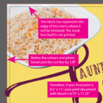
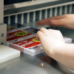
 Do you want your images or background colour to go right to the edge of your print? You’ll want to supply your file with bleeds. Bleeds are a 1/8” extension of backgrounds at the edge of the document for trimming. Think of your graphics as “bleeding” off the edge. Prints are always cut in stacks through a guillotine. Bleeds ensure that any slight shift of the graphic will result in a decisive and clean trim. For a detailed illustration of what bleeds look like, click on this visual example with a bowl of rice.
In addition to document bleeds, keep an inner safety margin of at least a 1/8” around your document to avoid having any items possibly trimmed off. This is the same theory as using bleeds. Safety margins ensure that any slight shift of the graphic will result in a decisive and clean trim.
When designing a file for print, always consider your finishing options. If your menu or brochure is going to be folded, ensure that key elements such as text or images aren’t creased in the wrong spot. If a booklet is being coil bound, leave ample space for the binding.
4 – Spell Check your work!
 Before you send us your print graphics, run a spell check! Avoid embarrassment and double check your text for grammar and accuracy. Having to re-print a menu with a pricing error is one of the most common mistakes. Review your entire document with multiple sets of eyes.
5 – Outline your fonts
 Computers often have common fonts such as Arial and Times New Roman. If your graphic uses a special font, outlining your text converts them into line art, which is ideal for print. If a computer doesn’t have your font installed, the design program replaces it with a different typeface and is often very different from the original. Outlined fonts are no longer editable, so create outlines as a final step and save it as a separate file name in case you need to revise text in the future.
 We hope these 5 file preparing tips for printing have been helpful. If designing your own print graphics seem daunting, we have a full-service team of Graphic Designers able to create or modify all your print graphics, signs, and so much more. Call or email us today to discuss your project and how we can help you look good!
519-885-1400 / Email Us sales@westmountsigns.com
