Westmount Signs & Printing | 1572 Highland Rd W. Kitchener, ON. N2N 3K6 | sales@westmountsigns.com
Designed & Developed by scaleup42.com
5 Tips To Create Signs That Get Noticed From 5 Excellent Sources
Every business owner longs for signs that will get noticed and stand out from the crowd. Below are highlights from 5 great articles from different websites with information about signage. We have chosen to highlight one tip from each of the articles in order to help you think through what you need from your signs. If you would like to learn more about us, or want to get started on a project, feel free to contact us by phoning us at 519-885-1400 or emailing us at sales@westmountsigns.com.
 The Right Colours
Ensuring that you have the right palette of colours is important if you want your signs to get noticed in a crowded environment like a busy street or retail neighbourhood. In this case, you should take advantage of bright, bold, attention-grabbing colours that won't get lost in the crowd.
However, it is also important to take a look at your current branding. If you plan to use your existing logo and branding, make sure the colour palette you plan to use on your new signage isn't overwhelming.
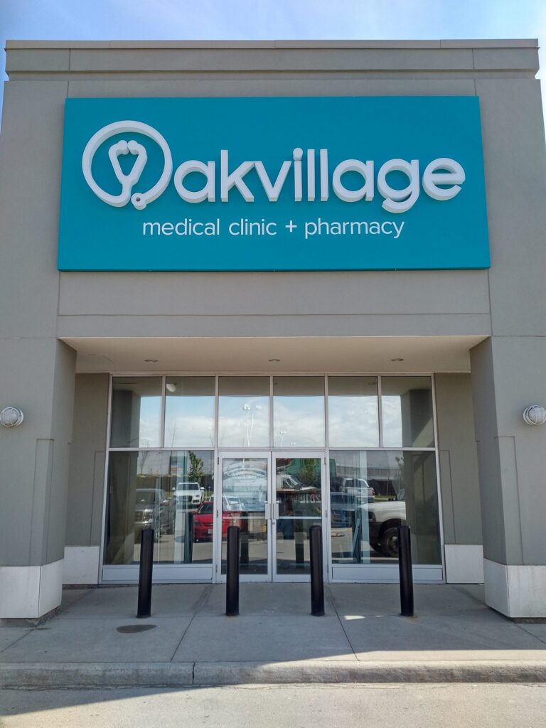
Remember that colours create and enhance moods and environments, so subtle colours can work best if you are looking to create a calm and peaceful atmosphere. The sign above conveys peace, calm, and serenity, which is exactly the right kind of atmosphere for a medical centre and pharmacy.
A Sign's Function
Make sure that your sign accomplishes that which it is intended to do. If its purpose is to provide information, make sure that the correct information is displayed. If your sign is intended to provide direction, then ensure that the instructions are clear and not confusing. When a sign's primary purpose is to warn of danger, make sure that the sign is very noticeable, with eye-catching colours, and that its line of sight is not obstructed in any way.
Obviously, signs can fulfil many other roles than we have listed, but the key point remains - make sure that the sign is designed in such a way that the reader cannot fail to understand its function! This sign on the right meets those requirements. Who could fail to understand that hot lunches are available and that the reader only has to follow the large, red arrow!
If its purpose is to provide information, make sure that the correct information is displayed. If your sign is intended to provide direction, then ensure that the instructions are clear and not confusing. When a sign's primary purpose is to warn of danger, make sure that the sign is very noticeable, with eye-catching colours, and that its line of sight is not obstructed in any way.
Obviously, signs can fulfil many other roles than we have listed, but the key point remains - make sure that the sign is designed in such a way that the reader cannot fail to understand its function! This sign on the right meets those requirements. Who could fail to understand that hot lunches are available and that the reader only has to follow the large, red arrow!
 The Bigger The Better
Many business owners are finding that outdoor signs can really add to their exposure, by drawing people into their businesses, increasing their sales, and improving their bottom line. It makes sense then, that with these signs, bigger is generally better. Larger signs that are both professionally designed, and well constructed, are almost always better at catching people's attention than smaller ones. Trying to ignore a large sign that draws the eye is difficult. The sign on the left accomplishes this with its bold font.
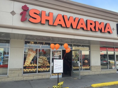
Keep It Short
Don't try to cram too much information on a sign. In the case of a sign, less is more. If it is an outdoor sign, remember that some people may be driving by and unable to read, or digest, a lot of information. It is better then, to limit your sign to the least amount of information that your potential customers need in order to make a decision.
The example below does just that, providing the business name, and their business activities in three words and a simple graphic.
The Bigger The Better
Many business owners are finding that outdoor signs can really add to their exposure, by drawing people into their businesses, increasing their sales, and improving their bottom line. It makes sense then, that with these signs, bigger is generally better. Larger signs that are both professionally designed, and well constructed, are almost always better at catching people's attention than smaller ones. Trying to ignore a large sign that draws the eye is difficult. The sign on the left accomplishes this with its bold font.
Keep It Short
Don't try to cram too much information on a sign. In the case of a sign, less is more. If it is an outdoor sign, remember that some people may be driving by and unable to read, or digest, a lot of information. It is better then, to limit your sign to the least amount of information that your potential customers need in order to make a decision.
The example below does just that, providing the business name, and their business activities in three words and a simple graphic.
 Choice Of Font
Your choice of font conveys a wealth of important information about you, your business and your personality. Always make sure that your font fits in well with your brand image. For example, if you want to project a serious, reliable, professional image then don't choose a light, flowery font!
Consider also the size and colour of the font or fonts that you are using. Think about the materials that you plan to use, and whether or not they will be 3D. If you are unsure about how to choose a font, ask an expert for advice. The sign for a pizza restaurant below uses a palette that is reminiscent of the Italian flag while the 3D letters stand out from the building and project towards the potential customer. Read more about font choice here.
Choice Of Font
Your choice of font conveys a wealth of important information about you, your business and your personality. Always make sure that your font fits in well with your brand image. For example, if you want to project a serious, reliable, professional image then don't choose a light, flowery font!
Consider also the size and colour of the font or fonts that you are using. Think about the materials that you plan to use, and whether or not they will be 3D. If you are unsure about how to choose a font, ask an expert for advice. The sign for a pizza restaurant below uses a palette that is reminiscent of the Italian flag while the 3D letters stand out from the building and project towards the potential customer. Read more about font choice here.

"Wonderful people and have done a countless number of signage projects for my cafe. Their designers are FANTASTIC and I’m always extremely happy with what they come up with. Their customer service is top notch and the prints always come out beautifully and quickly. A+ for speed, artwork, and customer service."
-Nikhil Katarya
Who Are Westmount Signs?
Without a doubt, we are the local leader in sign design, manufacturing and installation. We will collaborate with you on your project with you from start to finish, removing any doubt you may have about the process. Our office is conveniently located at 347 Weber Street North, Waterloo. Contact us today to get started on your next project.
Sources:
How To Make Attention Grabbing Signs
Get Your Outdoor Signs Noticed With These Good Tips