Logos & Branding – A Business Essential

Logos & Branding is a business essential. It’s the very first thing your customers see, from your physical surroundings such as restaurant signage and business cards, to digital marketing such as websites and social media channels. This is known as your corporate identity. Through images, colours and typography, a strong brand is what defines a confident business, be it large or small
 We at Westmount Signs & Printing work with brands every day on almost every project. From local companies here in Kitchener Waterloo such as The Culinary Studio and Sage Naturopathic Clinic, to larger more global businesses such as Colliers International and Subway Restaurants. With such a diverse portfolio, it’s imperative that we shed light on a common oversight by numerous customers, regardless of business size: We often receive flattened, low-resolution “rasterized” logo files. Most low resolution files are saved for internet applications, such as a JPEG, PNG or GIF. But in the sign and printing world, high resolution or “vector” files are superlative in every way and are essential for production. These are commonly saved as AI, EPS, or SVG files. But what’s the difference between vector and rasterized logos? Join us as we explore the process of working with, and creating, a successful logo and brand…
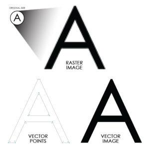 A raster file, such as a JPEG, GIF, or PNG is a group of pixels that form an image. The more you stretch them the blockier, or more pixelated, they get. Vector graphics are composed of paths/lines between points that form an image. Therefore if you stretch a vector file, the points keep their position and a crisp image is displayed.
All photographs are raster files. A JPEG (Joint Photographic Experts Group), PNG (Portable Network Graphic), or GIF (Graphics Interchange Format) are absolute giveaways. An easy way to differentiate the type of image is to simply zoom-in or stretch the file to see if there is any loss of quality. Or, simply Contact Us and we’ll let you know if your file is a vector.

 It’s fairly common that we’re asked to re-create or even re-design an image to work as a vector, and it would be our pleasure. As sign and printing experts, our Graphic Design team encourages the use of vector logos to maximize production quality. Common vector files are AI (Adobe Illustrator), EPS (Encapsulated PostScript), and SVG (Scalable Vector Graphics). You should always have your vector logo at the ready. Your corporate identity depends on it.
 Have you noticed that many successful brands have multiple versions of their logo? Check out these two examples from Domino’s Pizza. It is crucial that you have a horizontal and stacked/vertical version of your logo to be used when needed. For example, it is quite common for shopping plazas to have a horizontal space for each tenant fascia or storefront. We would use the horizontal version of a logo. But what if you wanted your logo maximized on a vertical poster? It would be best to use the stacked version. When designing your logo here at Westmount Signs & Printing, we provide you with all versions at no additional cost. It’s important to have a well-developed logo, and providing you with a complete package is fundamental.
 If a logo doesn’t work in black and white, colour will never save it. Did you also know that blue and green share the same tone when converted to grey? Your logo will be passed around offices, invoices, photocopiers and the like. If these processes are in black and white, your logo needs to be recognizable. Gradients, shadow effects and frills never successfully augment a logo.
This is especially true in the sign and printing industry due to the nature of gradients. These must be printed on vinyl rather than use a coloured material itself, which is preferred and far more confident. Furthermore, it is nearly impossible to fully match a gradient in real life due to the direction and rate of colour. Most sign companies use techniques to trick the eye in order to recreate a gradient effect, but it’s not ideal.

 As design experts we take colour theory very seriously. Logos are always designed to work in black and white before brand colour is added or defined.
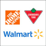 Do you want your logo in a shape or floating in space? The Home Depot logo is in a square, while the Canadian Tire logo is in a triangle. However, the Walmart logo is floating in space. The style of your logo is purely aesthetic and up to personal preference. The main difference is that logos that use a shape can also be used as a symbol, whereas floating logos often have the symbol on the side.

 After you’ve established the logo, your brand symbol can be introduced. Taking the above example, Walmart’s symbol is the yellow image to the right of the name. Or, another great example is the Nike logo. Take away the word “Nike” and what remains is the “Swoosh”. This is the next step in brand recognition and a useful tool when a quick visual is all that’s needed. Common uses for your symbol are your website favicon or smartphone apps, package design or merchandise, and your business profile picture on Social Media, such as Facebook, Twitter or Instagram.
Keep in mind that brands like Microsoft and Apple spent billions of dollars in advertising to build equity into their brand, so that their clients recognize their symbol. When starting a company we strongly recommend creating a clean logo with a clear name. Refrain from just applying a symbol on its own until your brand gains momentum.
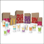
 Every successful brand has a tier list of primary and secondary colours. The primary colours are often shared with the logo itself, while the secondary colours are complementary. These are used for your website and social media, booklets and menus, and even wall paint colour. McDonald's primary colours are Red (hunger) and Yellow (speed). In 2016 they introduced an assortment of secondary colours in their quest to modernize themselves as a café rather than a fast-food chain. They introduced green and other organic colors to convey fresh, healthy foods.
 Your primary font is normally used in the logo itself. It is imperative that your choice of font be easily recognizable as some of the world’s most famous fonts have thus been characterized, such as the logos for Disney and Universal Studio’s Jurassic Park. Switch the fonts and you’ll have a clear understanding of just how successful they’ve been able to shape our perception of their brands.
 When designing a logo, it’s important to keep future applications in mind. It may look great on a computer screen, but can you hold it in your hand? A common oversight with logo design is the thickness of font, or lack thereof. When creating physical signage, the material must be capable of bending and shaped into every letter and image, with ample space for lights, welding, mounting, etc. When creating channel letters, we encourage a minimum thickness of 2” for every shape in order to create a minimum of 3” deep can. Objects that come to a sharp point are generally rounded (an industry standard) which gives the illusion of a pointed edge from a distance.
When designing your logos and branding here at Westmount Signs & Printing, we understand the importance of colour and font choices. With our help, we’ll develop your brand to stand confidently on its own. Colour theory and typography are in our blood.

 There are numerous reasons for re-branding. Some of the most common cases include new ownership (distancing from previous look), reaching a major milestone (commemorative), or to modernize an already established brand (evolution). Observe this before and after comparison we designed for Sweet & Savoury Pie Company in Kitchener. The owners wanted something modern and clean.
Are you ready to grow? Contact Us today and request a free consultation with one of our Graphic Designers. Most importantly, re-branding with us is the first step to building a beautiful relationship…
 When designing your logo and brand, we develop a bond with you and your corporate identity. Unlike other studios, we have a diverse team of specialists that shape our one-stop-shop. Having multiple businesses produce your signage, printing, and even digital marketing, would require you to explain your brand again and again, assuming they eventually understand your corporate look. Think of us as a Swiss Army Knife, able to handle all the above and more. Our team and technology produces signage, digital printing, laser engraving, clothing sublimation, electrical, installation, maintenance, graphic design, just to name a few. We are the best equipped to support your brand, and most importantly, understand your identity since it was developed here at our studio. Feel confident knowing that your baby is cared for by those who were there from the start.
For more information or to chat about Logos & Branding, give us a call.
We’re here to help: 519-885-1400 / Email Us sales@westmountsigns.com
Examples of Logos We’ve Designed
 We at Westmount Signs & Printing work with brands every day on almost every project. From local companies here in Kitchener Waterloo such as The Culinary Studio and Sage Naturopathic Clinic, to larger more global businesses such as Colliers International and Subway Restaurants. With such a diverse portfolio, it’s imperative that we shed light on a common oversight by numerous customers, regardless of business size: We often receive flattened, low-resolution “rasterized” logo files. Most low resolution files are saved for internet applications, such as a JPEG, PNG or GIF. But in the sign and printing world, high resolution or “vector” files are superlative in every way and are essential for production. These are commonly saved as AI, EPS, or SVG files. But what’s the difference between vector and rasterized logos? Join us as we explore the process of working with, and creating, a successful logo and brand…
Vector vs Raster Files
 A raster file, such as a JPEG, GIF, or PNG is a group of pixels that form an image. The more you stretch them the blockier, or more pixelated, they get. Vector graphics are composed of paths/lines between points that form an image. Therefore if you stretch a vector file, the points keep their position and a crisp image is displayed.
All photographs are raster files. A JPEG (Joint Photographic Experts Group), PNG (Portable Network Graphic), or GIF (Graphics Interchange Format) are absolute giveaways. An easy way to differentiate the type of image is to simply zoom-in or stretch the file to see if there is any loss of quality. Or, simply Contact Us and we’ll let you know if your file is a vector.

 It’s fairly common that we’re asked to re-create or even re-design an image to work as a vector, and it would be our pleasure. As sign and printing experts, our Graphic Design team encourages the use of vector logos to maximize production quality. Common vector files are AI (Adobe Illustrator), EPS (Encapsulated PostScript), and SVG (Scalable Vector Graphics). You should always have your vector logo at the ready. Your corporate identity depends on it.
Horizontal & Stacked Logos

 Have you noticed that many successful brands have multiple versions of their logo? Check out these two examples from Domino’s Pizza. It is crucial that you have a horizontal and stacked/vertical version of your logo to be used when needed. For example, it is quite common for shopping plazas to have a horizontal space for each tenant fascia or storefront. We would use the horizontal version of a logo. But what if you wanted your logo maximized on a vertical poster? It would be best to use the stacked version. When designing your logo here at Westmount Signs & Printing, we provide you with all versions at no additional cost. It’s important to have a well-developed logo, and providing you with a complete package is fundamental.
Logos MUST work in Black & White
 If a logo doesn’t work in black and white, colour will never save it. Did you also know that blue and green share the same tone when converted to grey? Your logo will be passed around offices, invoices, photocopiers and the like. If these processes are in black and white, your logo needs to be recognizable. Gradients, shadow effects and frills never successfully augment a logo.
This is especially true in the sign and printing industry due to the nature of gradients. These must be printed on vinyl rather than use a coloured material itself, which is preferred and far more confident. Furthermore, it is nearly impossible to fully match a gradient in real life due to the direction and rate of colour. Most sign companies use techniques to trick the eye in order to recreate a gradient effect, but it’s not ideal.

 As design experts we take colour theory very seriously. Logos are always designed to work in black and white before brand colour is added or defined.
Shape or Floating
 Do you want your logo in a shape or floating in space? The Home Depot logo is in a square, while the Canadian Tire logo is in a triangle. However, the Walmart logo is floating in space. The style of your logo is purely aesthetic and up to personal preference. The main difference is that logos that use a shape can also be used as a symbol, whereas floating logos often have the symbol on the side.
The Symbol

 After you’ve established the logo, your brand symbol can be introduced. Taking the above example, Walmart’s symbol is the yellow image to the right of the name. Or, another great example is the Nike logo. Take away the word “Nike” and what remains is the “Swoosh”. This is the next step in brand recognition and a useful tool when a quick visual is all that’s needed. Common uses for your symbol are your website favicon or smartphone apps, package design or merchandise, and your business profile picture on Social Media, such as Facebook, Twitter or Instagram.
Keep in mind that brands like Microsoft and Apple spent billions of dollars in advertising to build equity into their brand, so that their clients recognize their symbol. When starting a company we strongly recommend creating a clean logo with a clear name. Refrain from just applying a symbol on its own until your brand gains momentum.
Brand Colours

 Every successful brand has a tier list of primary and secondary colours. The primary colours are often shared with the logo itself, while the secondary colours are complementary. These are used for your website and social media, booklets and menus, and even wall paint colour. McDonald's primary colours are Red (hunger) and Yellow (speed). In 2016 they introduced an assortment of secondary colours in their quest to modernize themselves as a café rather than a fast-food chain. They introduced green and other organic colors to convey fresh, healthy foods.
Brand Fonts
Font is just as important given that typography literally communicates to your customers, and the style of the font conveys the tone of your business. Similar to your colour palette, you would have primary and secondary fonts used in titles, headers or captions, and body text. These are found everywhere from channel letters to flyers, window graphics to tradeshow banners. Your primary font is normally used in the logo itself. It is imperative that your choice of font be easily recognizable as some of the world’s most famous fonts have thus been characterized, such as the logos for Disney and Universal Studio’s Jurassic Park. Switch the fonts and you’ll have a clear understanding of just how successful they’ve been able to shape our perception of their brands.
 When designing a logo, it’s important to keep future applications in mind. It may look great on a computer screen, but can you hold it in your hand? A common oversight with logo design is the thickness of font, or lack thereof. When creating physical signage, the material must be capable of bending and shaped into every letter and image, with ample space for lights, welding, mounting, etc. When creating channel letters, we encourage a minimum thickness of 2” for every shape in order to create a minimum of 3” deep can. Objects that come to a sharp point are generally rounded (an industry standard) which gives the illusion of a pointed edge from a distance.
When designing your logos and branding here at Westmount Signs & Printing, we understand the importance of colour and font choices. With our help, we’ll develop your brand to stand confidently on its own. Colour theory and typography are in our blood.
When is it time to Re-brand?

 There are numerous reasons for re-branding. Some of the most common cases include new ownership (distancing from previous look), reaching a major milestone (commemorative), or to modernize an already established brand (evolution). Observe this before and after comparison we designed for Sweet & Savoury Pie Company in Kitchener. The owners wanted something modern and clean.
Are you ready to grow? Contact Us today and request a free consultation with one of our Graphic Designers. Most importantly, re-branding with us is the first step to building a beautiful relationship…
Building a Relationship with Westmount Signs & Printing
 When designing your logo and brand, we develop a bond with you and your corporate identity. Unlike other studios, we have a diverse team of specialists that shape our one-stop-shop. Having multiple businesses produce your signage, printing, and even digital marketing, would require you to explain your brand again and again, assuming they eventually understand your corporate look. Think of us as a Swiss Army Knife, able to handle all the above and more. Our team and technology produces signage, digital printing, laser engraving, clothing sublimation, electrical, installation, maintenance, graphic design, just to name a few. We are the best equipped to support your brand, and most importantly, understand your identity since it was developed here at our studio. Feel confident knowing that your baby is cared for by those who were there from the start.
For more information or to chat about Logos & Branding, give us a call.
We’re here to help: 519-885-1400 / Email Us sales@westmountsigns.com

